
Foundation
Orbit
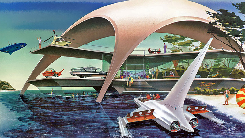
Orbit is an easy to use, powerful image slider that's responsive, allowing you to swipe on a touch-enabled device.
-
 Caption One. Pellentesque habitant morbi tristique senectus et netus et malesuada fames ac turpis egestas.
 -
 Caption Two. Pellentesque habitant morbi tristique senectus et netus et malesuada fames ac turpis egestas.
 -
 Caption Three. Pellentesque habitant morbi tristique senectus et netus et malesuada fames ac turpis egestas.
Build Orbit With HTML
Building Orbit is pretty simple using our HTML classes and structure; you'll just need to write the markup, find some images or text, fire up the Javascript and you'll be ready to go. On touch-enabled devices, Orbit has swipe functionality that makes it easy to switch slides. On screens without touch interfaces, you'll see bullet and arrow navigation if you have the options setup in your JS. Here's markup structure for Orbit:
<ul data-orbit>
  <li>
    <img src="../img/demos/demo1.jpg" />
    <div class="orbit-caption">...</div>
  </li>
  <li>
    <img src="../img/demos/demo2.jpg" />
    <div class="orbit-caption">...</div>
  </li>
  <li>
    <img src="../img/demos/demo3.jpg" />
    <div class="orbit-caption">...</div>
  </li>
</ul>
We'll Automatically Add HTML
To keep your markup really clean, we've let JS add what's needed for the navigation, bullets and other parts of the plugin. Once the page has been loaded, your markup will look different. Below is an example of the markup so you know what to target.
<!-- Orbit Container -->
<div class="orbit-container">
  <ul data-orbit="" class="orbit-slides-container">
    <li>
      <img src="../img/demos/demo3.jpg">
      <div class="orbit-caption">...</div>
    </li>
    <li class="active">
      <img src="../img/demos/demo1.jpg">
      <div class="orbit-caption">...</div>
    </li>
    <li>
      <img src="../img/demos/demo2.jpg">
      <div class="orbit-caption">...</div>
    </li>
    <li>
      <img src="../img/demos/demo3.jpg">
      <div class="orbit-caption">...</div>
    </li>
    <li>
      <img src="../img/demos/demo1.jpg">
      <div class="orbit-caption">...</div>
    </li>
  </ul>

  <!-- Prev/Next Arrows -->
  <a href="#" class="orbit-prev">Prev <span></span></a>
  <a href="#" class="orbit-next">Next <span></span></a>

  <!-- Slide Numbers -->
  <div class="orbit-slide-number">
    <span>1</span> of <span>3</span>
  </div>

  <!-- Timer and Play/Pause Button -->
  <div class="orbit-timer">
    <span></span>
    <div class="orbit-progress" style="width: 100%; -webkit-transition: width 10s linear;"></div>
  </div>
</div>

<!-- Orbit Bullet Slide Indicator -->
<ol class="orbit-bullets">
  <li data-orbit-slide-number="1"></li>
  <li data-orbit-slide-number="2" class="active"></li>
  <li data-orbit-slide-number="3"></li>
</ol>
-
Headline 1
Subheadline
Pellentesque habitant morbi tristique senectus et netus et malesuada fames ac turpis egestas. Vestibulum tortor quam, feugiat vitae, ultricies eget, tempor sit amet, ante. Donec eu libero sit amet quam egestas semper. Aenean ultricies mi vitae est. Mauris placerat eleifend leo. Quisque sit amet est et sapien ullamcorper pharetra. Vestibulum erat wisi, condimentum sed, commodo vitae, ornare sit amet, wisi. Aenean fermentum, elit eget tincidunt condimentum, eros ipsum rutrum orci, sagittis tempus lacus enim ac dui. Donec non enim in turpis pulvinar facilisis. Ut felis. Praesent dapibus, neque id cursus faucibus, tortor neque egestas augue, eu vulputate magna eros eu erat. Aliquam erat volutpat. Nam dui mi, tincidunt quis, accumsan porttitor, facilisis luctus, metus
-
Headline 2
Subheadline
Pellentesque habitant morbi tristique senectus et netus et malesuada fames ac turpis egestas. Vestibulum tortor quam, feugiat vitae, ultricies eget, tempor sit amet, ante. Donec eu libero sit amet quam egestas semper. Aenean ultricies mi vitae est. Mauris placerat eleifend leo. Quisque sit amet est et sapien ullamcorper pharetra. Vestibulum erat wisi, condimentum sed, commodo vitae, ornare sit amet, wisi. Aenean fermentum, elit eget tincidunt condimentum, eros ipsum rutrum orci, sagittis tempus lacus enim ac dui. Donec non enim in turpis pulvinar facilisis. Ut felis. Praesent dapibus, neque id cursus faucibus, tortor neque egestas augue, eu vulputate magna eros eu erat. Aliquam erat volutpat. Nam dui mi, tincidunt quis, accumsan porttitor, facilisis luctus, metus
-
Headline 3
Subheadline
Pellentesque habitant morbi tristique senectus et netus et malesuada fames ac turpis egestas. Vestibulum tortor quam, feugiat vitae, ultricies eget, tempor sit amet, ante. Donec eu libero sit amet quam egestas semper. Aenean ultricies mi vitae est. Mauris placerat eleifend leo. Quisque sit amet est et sapien ullamcorper pharetra. Vestibulum erat wisi, condimentum sed, commodo vitae, ornare sit amet, wisi. Aenean fermentum, elit eget tincidunt condimentum, eros ipsum rutrum orci, sagittis tempus lacus enim ac dui. Donec non enim in turpis pulvinar facilisis. Ut felis. Praesent dapibus, neque id cursus faucibus, tortor neque egestas augue, eu vulputate magna eros eu erat. Aliquam erat volutpat. Nam dui mi, tincidunt quis, accumsan porttitor, facilisis luctus, metus
Deep Linking Support
You can now link to slides in Orbit. This is useful when constructing custom bullets or referencing a particular slide in a description. To see it in action click on one of the links below:
The markup is simple, each <li> should have a data-orbit-slide data attribute with a unique identifier for the slide. Then anywhere outside of your Orbit slider you can use data-orbit-link to reference that slide.
<ul data-orbit>
  <li data-orbit-slide="headline-1">
    <h2>Headline 1</h2>
    <h3>Subheadline</h3>
    <p>Pellentesque habitant morbi tristique senectus.</p>
  </li>
  <li data-orbit-slide="headline-2">
    <h2>Headline 2</h2>
    <h3>Subheadline</h3>
    <p>Pellentesque habitant morbi tristique senectus.</p>
  </li>
  <li data-orbit-slide="headline-3">
    <h2>Headline 3</h2>
    <h3>Subheadline</h3>
    <p>Pellentesque habitant morbi tristique senectus.</p>
  </li>
</ul>

<!-- Now link to the slides above -->
<ul class="disc">
  <li><a href="#" data-orbit-link="headline-1">Goto Slide 1</a></li>
  <li><a href="#" data-orbit-link="headline-2">Goto Slide 2</a></li>
  <li><a href="#" data-orbit-link="headline-3">Goto Slide 3</a></li>
</ul>
Graceful Loading & Preloader
We've cleaned up how Orbit initializes by adding a wrapper feature that stops the ugly flash of unstyled content. Here's the markup needed:
<div class="slideshow-wrapper">
  <ul id="featured2" data-orbit>
    <!-- Orbit slides -->
  </ul>
</div>
To add the preloader, simply include a div class="preloader" right inside the wrapper, like so:
<div class="slideshow-wrapper">
  <div class="preloader"></div>
  <ul data-orbit>
    <!-- Orbit slides -->
  </ul>
</div>
Available SCSS Variables
We've included a bunch of variables that you'll be able to use if you're into getting SASSy with things.
$include-html-orbit-classes: $include-html-classes;

/* We use these to control the caption styles */
$orbit-container-bg: #f5f5f5;
$orbit-caption-bg: rgba(0,0,0,0.6);
$orbit-caption-font-color: #fff;
$orbit-caption-font-size: emCalc(14);
$orbit-caption-position: "bottom";    // Supported values: "bottom", "under"
$orbit-caption-padding: emCalc(10,14);
$orbit-caption-height: auto;

/* We use these to control the left/right nav styles */
$orbit-nav-bg: rgba(0,0,0,0.6);
$orbit-nav-bg-hover: rgba(0,0,0,0.6);
$orbit-nav-arrow-color: #fff;
$orbit-nav-arrow-color-hover: #ccc;

/* We use these to control the timer styles */
$orbit-timer-bg: rgba(0,0,0,0.6);
$orbit-timer-show-progress-bar: true;

/* We use these to control the bullet nav styles */
$orbit-bullet-nav-color: #999;
$orbit-bullet-nav-color-active: #222;
$orbit-bullet-radius: emCalc(18);

/* We use these to controls the style of slide numbers */
$orbit-slide-number-bg: rgba(0,0,0,0);
$orbit-slide-number-font-color: #fff;
$orbit-slide-number-padding: em-calc(5px);

/* Graceful Loading Wrapper and preloader */
$wrapper-class: "slideshow-wrapper";
$preloader-class: "preloader";
Using the JavaScript
foundation.js are available on your page. You can refer to the javascript documentation on setting that up.
Just add foundation.orbit.js AFTER the foundation.js file. Your markup should look something like this:
<body>

  ...

  <script>
      document.write('<script src=/js/vendor/'
        + ('__proto__' in {} ? 'zepto' : 'jquery')
        + '.js><\/script>');
    </script>

  <script src="js/foundation/foundation.js"></script>
  <script src="js/foundation/foundation.orbit.js"></script>
  <!-- Other JS plugins can be included here -->

  <script>
    $(document).foundation();
  </script>

</body>
Required Foundation Library: foundation.orbit.js
Then, you'll need to add a data-orbit data attribute to make the JS work properly on that element. That looks like:
<ul data-orbit>
  ...
</ul>
Optional JavaScript Configuration
Orbit options can only be passed in during initialization at this time.
$(document).foundation('orbit', {
  animation: 'fade',
  timer_speed: 10000,
  pause_on_hover: true,
  resume_on_mouseout: false,
  animation_speed: 500,
  stack_on_small: true,
  navigation_arrows: true,
  slide_number: true,
  container_class: 'orbit-container',
  stack_on_small_class: 'orbit-stack-on-small',
  next_class: 'orbit-next',
  prev_class: 'orbit-prev',
  timer_container_class: 'orbit-timer',
  timer_paused_class: 'paused',
  timer_progress_class: 'orbit-progress',
  slides_container_class: 'orbit-slides-container',
  bullets_container_class: 'orbit-bullets',
  bullets_active_class: 'active',
  slide_number_class: 'orbit-slide-number',
  caption_class: 'orbit-caption',
  active_slide_class: 'active',
  orbit_transition_class: 'orbit-transitioning',
  bullets: true,
  timer: true,
  variable_height: false,
  before_slide_change: function(){},
  after_slide_change: function(){}
});
Starting in 4.0.7 you can also use the data-options attribute to pass configuration settings to Orbit. Treat it like a style property:
<ul data-orbit data-options="timer_speed:2500; bullets:false;">
  ...
</ul>
Events
You can bind to the following events in your code.
| Event | Params | Description |
|---|---|---|
| orbit:ready | event | Fires when the slider has loaded |
| orbit:before-slide-change | event | Fires before a slide changes |
| orbit:after-slide-change | event, orbit | Fires after a slide transition animation has finished. The orbit parameter contains slide_number and total_slides. |
| orbit:timer-started | event | Fires each time the timer is started/resumed |
| orbit:timer-stopped | event | Fires each time the timer is paused/stopped |
Example
Here's an example of how you can bind to these events:
<ul id="featured1" data-orbit>
  <li>
    <img src="../img/demos/demo1.jpg" />
    <div class="orbit-caption">...</div>
  </li>
  <li>
    <img src="../img/demos/demo2.jpg" />
    <div class="orbit-caption">...</div>
  </li>
  <li>
    <img src="../img/demos/demo3.jpg" />
    <div class="orbit-caption">...</div>
  </li>
</ul>

<script>
$("#featured1").on("orbit:ready", function(event) {
  console.info("ready");
});
$("#featured1").on("orbit:before-slide-change", function(event) {
  console.info("before slide change");
});
$("#featured1").on("orbit:after-slide-change", function(event, orbit) {
  console.info("after slide change");
  console.info("slide " + orbit.slide_number + " of " + orbit.total_slides);
});
$("#featured1").on("orbit:timer-started", function(event, orbit) {
  console.info("timer started");
});
$("#featured1").on("orbit:timer-stopped", function(event, orbit) {
  console.info("timer stopped");
});
</script>